# Which Map Projection Should You Use? Natural Earth vs Equal Earth vs Mercator (and 3 more)
A practical guide to the six world map projections in Oh My Maps!: what each one distorts, what it preserves, and which to pick for a travel map, a choropleth, a navigation chart or a slide.
> Editor: https://ohmymaps.com/ · Versão em página: https://ohmymaps.com/blog/which-map-projection-should-you-use/
Every flat world map is wrong. The Earth's surface cannot be laid out on a plane
without stretching something, so a projection is a choice about _which_ error you
are willing to live with: area, shape, distance, or direction. You can preserve
some. You can never preserve all.
That makes "which projection should I use?" a question with an actual answer,
once you know what the map is for. Here are the six available in
[Oh My Maps!](https://ohmymaps.com/), what each one gives up, and when to reach
for it.
## The short answer
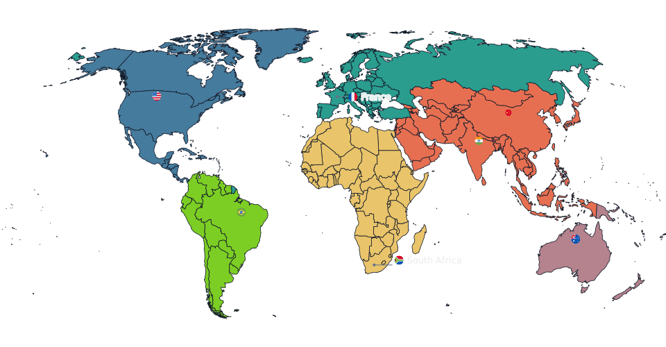
**Use Natural Earth.** It is the default for a reason: no compromise projection
here is more honest about area without asking you to trade away shape or fill a
strict rectangle, which is the property that matters for almost every map where
countries are coloured by something. Switch away only when you have a specific
reason, and the sections below are the specific reasons.
## Natural Earth: the default, and the general answer
**Preserves:** nothing exactly, but area and shape both stay close everywhere.
**Distorts:** everything a little, worst near the poles.
Natural Earth is a _compromise_ projection: it was designed by eye to look right
rather than to satisfy a mathematical constraint. Areas are close but not exact,
shapes are plausible everywhere, and the rounded corners read as a globe unrolled
rather than a rectangle.
Use it for choropleth maps, travel maps, "countries where we operate", coverage
maps, teaching maps, and general-purpose reference maps: anything where the map
needs to be roughly honest about size without becoming an argument about a
specific number.
## Robinson: the classic compromise
**Preserves:** nothing exactly. **Distorts:** area moderately, shape mildly.
Robinson is the compromise projection you have seen your whole life. National
Geographic used it for their world maps from 1988 to 1998, and it became the
default look of "a world map" for a generation. It is very close to Natural Earth
in intent; the differences are in the curvature of the meridians and the
treatment of high latitudes.
Use it when you want a familiar, institutional look: textbooks, reports,
newspaper graphics. It is a reasonable choice for a choropleth if you accept
mild area error in exchange for that familiarity.
## Equal Earth: exact area, and the one the UN named
**Preserves:** area, exactly. **Distorts:** shape and angle, worst at the edges.
Equal Earth is an equal-area projection published in 2018. Any two regions with
the same area on the globe get the same area on the map, everywhere, with no
approximation. Africa comes out fourteen times the size of Greenland because it
is.
What makes it worth having alongside Natural Earth is that it manages this
without looking strange. It was designed to echo Robinson's familiar outline,
with rounded edges and pole lines, which is exactly what older equal-area maps
like Gall-Peters failed at.
In September 2026 the UN General Assembly
[named this projection in a resolution](/blog/un-equal-earth-map-resolution/)
recommending equal-area maps for education, media and digital platforms.
Use it when a reader will compare the shaded area of one country against
another: population, land use, emissions, anything per unit of ground, and any
teaching map. Use Natural Earth instead when the map is categorical and no size
claim is being made.
## Miller: rectangular, minus the worst of Mercator
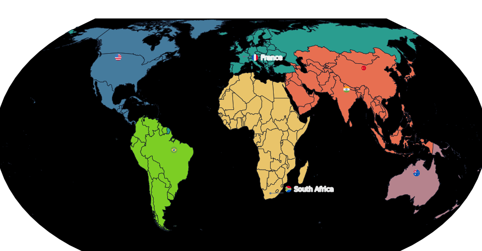
**Preserves:** nothing exactly. **Distorts:** area substantially at high
latitudes, though far less than Mercator.
Miller is a cylindrical projection: meridians are straight vertical lines, so the
map fills a rectangle edge to edge. It is essentially Mercator's stretching
turned down. The poles are finite, so Antarctica is drawn normally and the map
has a top and a bottom.
Use it when the map has to fill a rectangular space with no wasted margins: a
slide background, a banner, a printed page where the map is the whole layout.
Do not use it for area comparisons.
## Mercator: for bearings, and almost nothing else
**Preserves:** angles and local shape (it is conformal); a straight line is a
constant compass bearing. **Distorts:** area, catastrophically, toward the poles.
Mercator exists to solve one problem, and it solves it perfectly: on a Mercator
chart, a straight line is a rhumb line, a course of constant bearing. That is why
it has been the navigator's projection since 1569 and why web map tiles use a
variant of it.
For a thematic world map it is close to the worst choice available. Greenland
appears roughly the size of Africa (Africa is about 14 times larger). Russia,
Canada and Scandinavia dominate the frame. Any map coloured by a per-country
value inherits that bias directly.
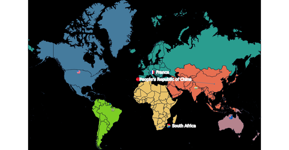
The same map on Mercator. Note how the far north balloons compared with the Natural Earth version above.
**Antarctica is excluded on Mercator here, and that is not a bug.** The
projection diverges at ±90°: the poles are at infinite distance, so a landmass
that reaches the pole cannot be drawn. Every Mercator world map deals with this
somehow, usually by cropping around ±85°.
Use Mercator for navigation, for anything that must line up with web map tiles,
or when you specifically want to make a point about Mercator.
## Orthographic: the globe
**Preserves:** the honest impression of a sphere. **Distorts:** everything toward
the limb, and hides half the world.
Orthographic is the view of Earth from infinitely far away: what a globe looks
like in a photograph. **You can rotate it by dragging**, so you can put any region
in the centre.
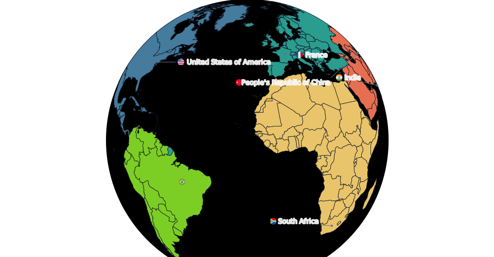
Use it when one hemisphere _is_ the story: a regional map that should not pretend
to be global, a launch covering the Americas, travel concentrated in Asia, a
title slide. Do not use it for global comparison: half your countries are simply
not visible, and the ones near the edge are compressed into slivers.
## Quick reference
| Projection | Area | Shape | Best for |
| ------------- | -------------- | ------------ | ------------------------------------------ |
| Natural Earth | near-exact | good | choropleths, travel maps, anything shaded |
| Robinson | near-exact | good | textbooks, reports, familiar look |
| Equal Earth | exact | fair at edges | area comparisons, teaching, per-area data |
| Miller | poor at poles | fair | rectangular layouts, banners |
| Mercator | very poor | exact, local | navigation, web tiles |
| Orthographic | limb-distorted | good centre | one hemisphere, title art |
## Switching is free
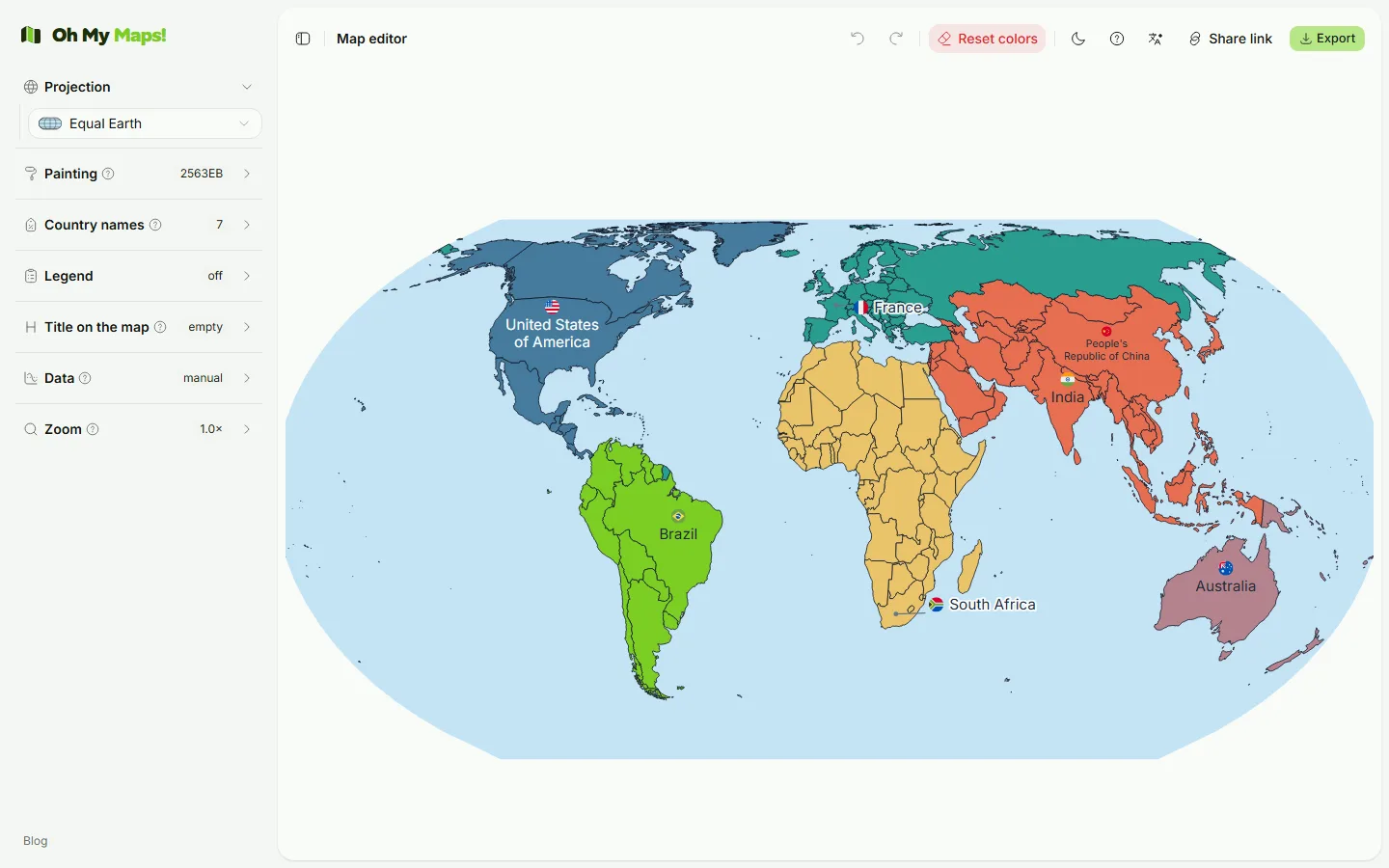
Changing projection in the editor re-renders the same map: your colours, labels,
legend and data all survive the switch. So the practical advice is: build the map
in Natural Earth, then click through the others before exporting. It takes ten
seconds and it is the fastest way to see how much of your map's impression was
coming from the frame rather than from your data.
See the difference. Paint a few countries, then cycle through all six projections: the same map, six arguments.
---
Related reading:
[How to make a custom world map online](/blog/how-to-make-a-custom-world-map-online/)
and
[How to create a choropleth map from spreadsheet data](/blog/choropleth-map-from-spreadsheet/).