How to Make a Map of Brazil's States
·7 min·View as Markdown
TagsRegional MapsChoropleth MapsSpreadsheet Import
Written byJordan Hale — Writer, Oh My Maps!
Contents
Almost every Brazilian dataset arrives broken down by state: census figures, election results, sales by region, where a company’s stores are. Turning that into a map is a five-minute job that usually costs an afternoon, because the obvious tools are a GIS package, a charting library, or a shapefile you have to find first.
ohmymaps.com/brazil/ is the short path: the same browser editor as the world map, loaded with the 27 federative units. No account, nothing uploaded, no watermark on the export.
What is on the map
All 27 federative units (the 26 states and the Federal District), each one a separate clickable shape. Roraima and Amapá are there at full size; the Federal District, which is small enough to disappear in a lot of simplified datasets, is preserved and clickable (zoom in first).
Names come in three languages and carry their accents properly: Espírito Santo,
Pará, Amapá, Rondônia, Ceará, Goiás, Maranhão, Paraíba, Piauí.
The interface language decides which set you see, and the editor exists in
Portuguese at ohmymaps.com/pt/brazil/ as well
as in English and Spanish.
The geometry is Natural Earth’s public-domain administrative boundaries, which is worth one sentence because it explains what you can do with the result: the source imposes no attribution and no share-alike condition, so the map you export is yours to put in a report you sell.
One projection, and no projection picker
The world map offers five projections and a picker to choose between them. This map is drawn in a conic conformal projection with the standard parallels set for Brazil, and there is no picker in the sidebar at all.
That is the honest configuration rather than a missing feature. A conic projection fitted to the country keeps the shape of the territory right from Roraima to Rio Grande do Sul; a world Mercator, dropped onto the same coordinates, stretches the far south against the north for reasons that have nothing to do with Brazil. Offering both would be offering a worse map in the control that sits at the top of the sidebar. Where the choice between projections is real, on the world map, there is a whole article about it: Which map projection should you use?.
Painting by hand
Pick a colour under Painting (Pintura) and click states. The three things worth knowing on the first map:
- Clicking a state that already has the current colour clears it. Painting is a toggle, so a misclick is fixed by clicking again.
- Shift+click or Ctrl+click applies instead of toggling: what you want when sweeping across a run of neighbouring states.
- Right-click a state for its own small menu: choose a colour, apply a pattern, or toggle Show name to label that one state.
Everything is undoable with Ctrl+Z, one state per step.
27 shapes, one click each. The Brazil map opens blank and ready: no sign-up, no upload, and it saves in your browser as you go.
Open the Brazil mapThe five IBGE regions in one click
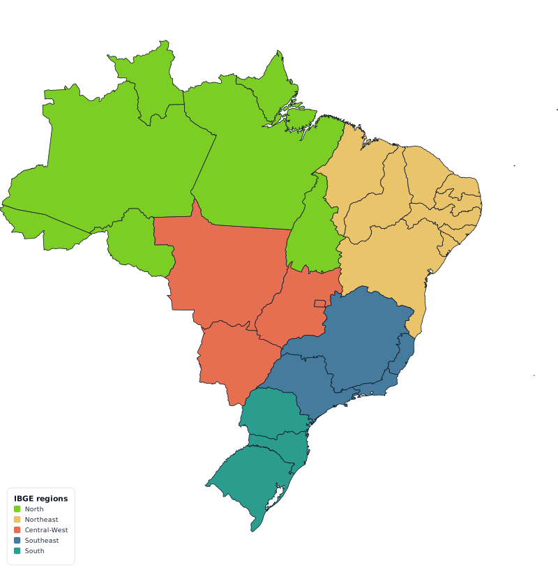
The Group control offers Brazil’s five official regions (North, Northeast, Central-West, Southeast and South) and applies the current colour to a whole region in a single action, which is a single undo step.
This is the IBGE division, the one every official statistical table uses, and it has been stable since Tocantins was created in 1988 and put in the North. The Federal District belongs to the Central-West. The five regions cover the 27 units exactly once, so “colour each region differently” is five clicks and produces a map with no gaps and no overlaps.
If your own grouping differs, say a sales territory that splits the Southeast, apply the region and then click the two or three states you want moved.
Importing a spreadsheet
Switch to Data mode and paste two columns, state and value, straight out of Excel, Google Sheets or Numbers. A spreadsheet copy is TSV, so plain paste works; CSV works too.
The state column can be either of two things:
- The full name, in Portuguese, English or Spanish, with or without accents.
São Paulo,Sao Paulo,SAO PAULOandDistrito Federalall match. - The two-letter code:
SP,RJ,MG,DF.
Those are the two forms real spreadsheets carry, and they are what the matcher
indexes. IBGE numeric codes (35 for São Paulo) and ISO subdivision codes
(BR-SP) are not recognised on this map: if your source uses them, add a
name or abbreviation column before pasting.
What the map deliberately does not do is fall back on country tables. Half the
Brazilian abbreviations are also country codes (PA is Panama, PE is Peru,
MA is Morocco, ES is Spain, RO is Romania, SE is Sweden), so consulting
the world’s country list would quietly land Panama’s figure on Pará. The import
preview reports what matched and lists what did not, before anything is applied.
Read that list; it is where the “Total” row at the bottom of your sheet turns up.
Colouring by numbers
Once the values are in, the scale carries the argument:
- Sequential for a quantity with no meaningful midpoint: population, GDP, vaccination coverage, number of stores.
- Diverging when there is a real centre readers should see: change against last year, the margin between two candidates, distance from the national average.
- Custom thresholds when the break points mean something outside the data: income brackets, a regulatory limit.
States with no value get a dedicated no-data colour, distinct from the bottom of
the scale, because “we have no figure for Acre” and “Acre is last” are different
claims. The legend in data mode is generated from the scale, so it cannot
disagree with the colours. The mechanics (class counts, quantiles versus equal
intervals, the per-column decimal-separator detection that keeps 10.294,7 from
becoming a thousand-fold error) are all in
How to create a choropleth map from spreadsheet data.
Two things this map does not have
- No municipalities and no mesoregions. The unit is the federative unit; there is no drill-down below it.
- No state flags. Flags are switched off on the state maps on purpose,
because the flag lookup is by country code:
PRwould fetch Puerto Rico’s flag andAMArmenia’s: the wrong flag, silently, which is worse than no flag.
Labels, legend, export
Turn on State names and search for the ones you want labelled. Naming all 27 is rarely the right call; naming the six you are talking about is. When a name is too big for its state, the label moves into a callout box beside it with a short leader line instead of writing across two neighbours.
The legend, in hand-painted mode, is a list you write: a title and one colour + label row per category. Put it in whichever of the four corners is emptiest: on this frame that is usually the bottom left, where the country narrows towards the south. Title on the map bakes a heading into the image itself.
Export gives you PNG, JPEG, WebP or SVG at 2000, 4000 or 8000 px on the long edge: 4000 for a slide or a page, 8000 for print, SVG when the figure will be resized or edited later in Illustrator, Inkscape or Figma. Nothing is watermarked.
Share link compresses the whole map into a URL fragment, so a link reproduces
your map for whoever opens it without anything being stored on a server. Save
file writes a .json you can reopen later.
Each map keeps its own autosave, so opening the world map does not overwrite your Brazil map. That storage is per-browser and per-machine, though: if the map matters, keep the file.
Next steps
- The full tour of the editor: written against the world map, but painting, legend and export work the same here.
- Choropleth maps from spreadsheet data: scales, classes and missing data.
- A US election map: the same workflow on the 50 states and DC.
Ready to make yours? Oh My Maps! is free, runs in the browser and needs no sign-up. Your map is saved locally as you work, and exports carry no watermark.
Open the editor