How to Create a Choropleth Map from Spreadsheet Data
·6 min·View as Markdown
TagsChoropleth MapsSpreadsheet ImportMap Projections
Written byJordan Hale — Writer, Oh My Maps!
Contents
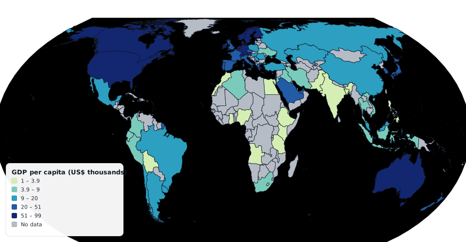
A choropleth map shades each country by a number: GDP per capita, vaccination rate, election result, how many of your users live there. The mechanics are easy enough that the tooling should be invisible, and mostly it is not: you end up in a spreadsheet add-in, or a charting library, or a GIS package, for what is fundamentally “colour these numbers”.
Here is the short path with Oh My Maps!: paste, choose a scale, export.
1. Get your data into two columns
You need a country column and a value column. That is it. Extra columns are fine; you will map them at import.
Country       Value
Brazil        212.6
Germany       83.2
Japan         123.9
Both CSV and TSV work, which in practice means you can select cells in Excel, Google Sheets or Numbers and copy them straight out: a spreadsheet copy is TSV.
Countries can be named in English, Portuguese or Spanish; the matcher uses the same name data the interface does.
2. Paste it
Switch the map to Data mode and open the import dialog. Paste, and you get a preview before anything is applied: which column is the country, which is the value, how many rows matched, and, importantly, a list of what did not match. That report is the part worth reading. Alternate spellings, “Korea, South”, a stray total row at the bottom: they show up there instead of silently vanishing.
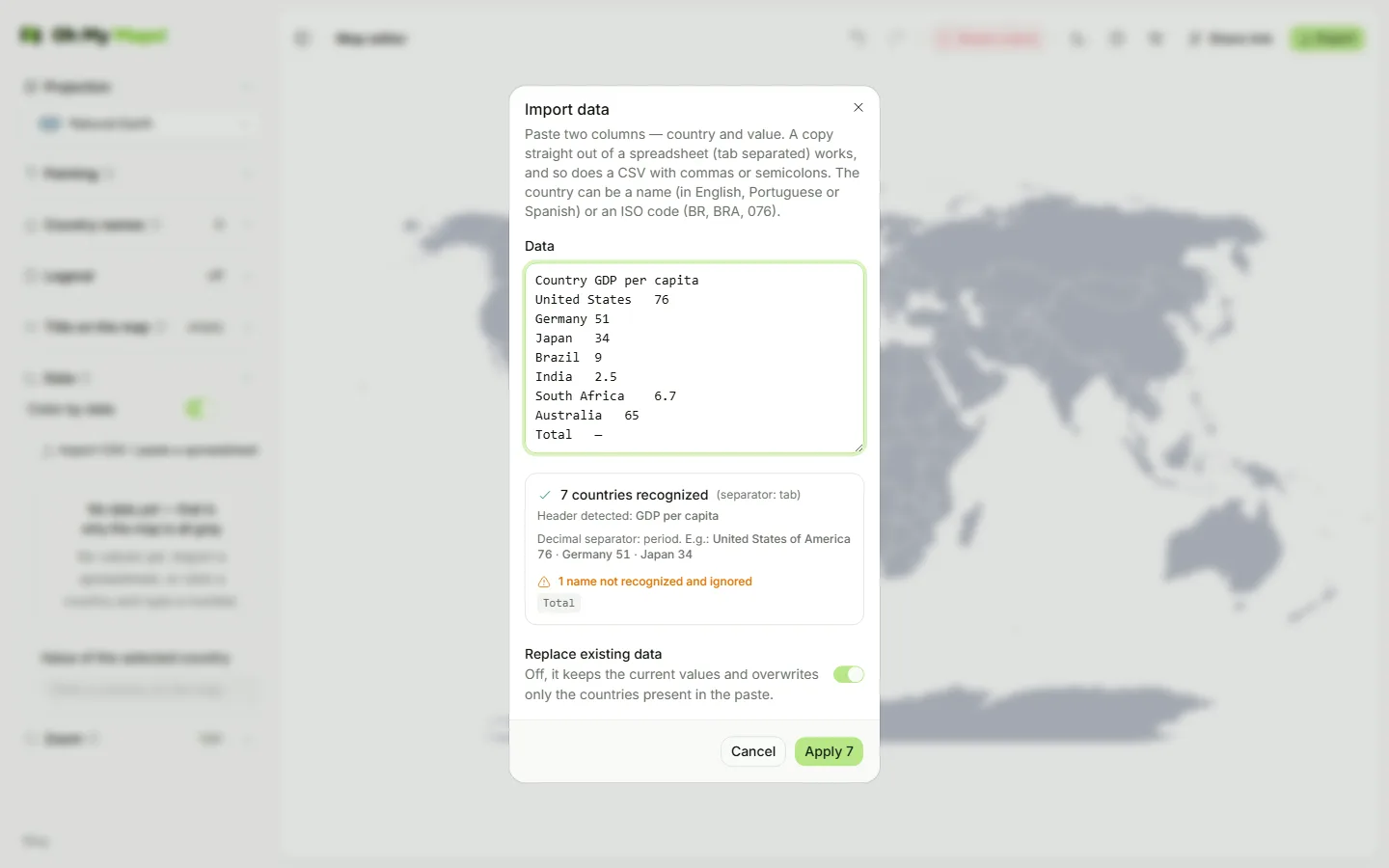
One detail that saves an entire class of wrong maps: the decimal separator is
detected per column, not per cell. A column holding 10.294,7 and 13.730
together is unambiguous when you look at the column as a whole and completely
ambiguous cell by cell: read one at a time, you get a silent factor-of-a-thousand
error in the middle of your data. Here it is decided once for the column.
If you would rather not import at all, you can type values directly: in data mode clicking a country selects it for editing instead of painting it, and there is a batch table for entering many at once.
Try it with real numbers. Copy two columns out of a spreadsheet and paste: the import preview tells you what matched before anything changes.
Open the editor3. Choose a colour scale
There are 8 sequential scales and 7 diverging ones, from the standard
d3-scale-chromatic set. The choice is not decorative:
- Sequential: one hue running light to dark. Use it when your values run from low to high with no meaningful midpoint: population, revenue, number of users, temperature in a single season.
- Diverging: two hues meeting at a neutral middle. Use it when there is a real centre that readers should see: change versus last year (zero), a margin between two parties, above/below a national average. A diverging scale on data with no midpoint invents a distinction that is not there; a sequential scale on data with one hides it.
There is also an invert toggle, for when “high is bad” and the dark end should sit at the other side.
4. Choose how values become classes
This is the decision that changes the map most, and the one most tools make for you silently. Four options:
- Equal intervals: the value range is cut into equal-width bands. Honest about the numbers, but a single outlier can flatten everything else into one band. Good for evenly spread data and for percentages, where the bands are meaningful on their own (0–20, 20–40, …).
- Quantiles: each band holds roughly the same number of countries. Always produces a visually balanced map, which is exactly the risk: it will show sharp differences even where the underlying values barely differ. Good for ranking and comparison, bad for “how much”.
- Custom thresholds: you type the break points. The right answer whenever the breaks mean something outside the data: income brackets, a regulatory limit, before/after a policy line.
- Continuous: no classes at all, a smooth gradient. Best when you want the overall shape rather than membership in a group, and it gets a gradient bar in the legend instead of discrete swatches.
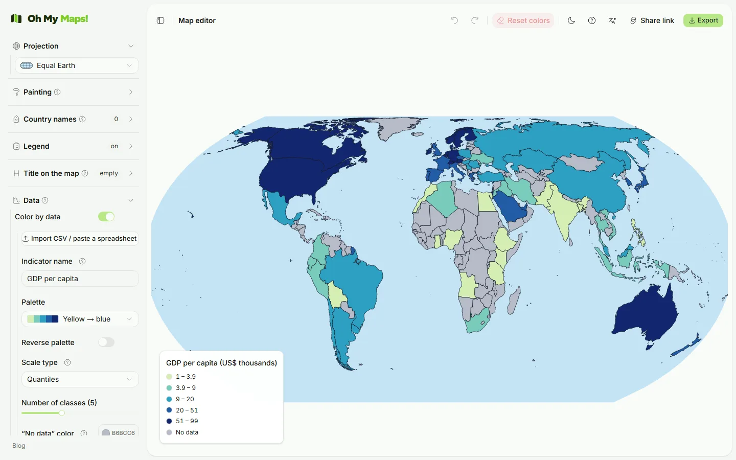
For classed scales, the number of classes is yours to set. Five is the usual default for good reason: readers cannot reliably match more than about seven shades back to a legend.
5. Handle missing data on purpose
Countries with no value get a dedicated no-data colour, deliberately distinct from the lowest value in the scale: otherwise “we have no figure for Chad” reads as “Chad is at the bottom”, which is a different and much worse claim. Keep it clearly neutral (a grey), and include it in the legend when the gaps are part of the story.
If you switch to data mode before importing anything, the whole world goes grey and the panel says so explicitly rather than leaving you to guess.
6. The legend comes from the scale
You do not build the legend by hand in data mode: it is generated from the
scale, classes and colours you chose, so it cannot drift out of sync with the
map. Continuous scales get a <linearGradient> bar. You still control position
(four corners) and font size, and the title.
The same legend object is used on screen and in the export, so what you approve is what ships.
7. Check it in a projection that does not lie
Choropleth maps and projections interact badly if you are not careful, because the reader’s impression is driven by area of ink. On Mercator, Greenland, Canada and Russia are enormously inflated: a map shaded by any per-country value will look like it is mostly about the far north.
Use Natural Earth (the default) or Robinson. Natural Earth keeps area close to reality, which is the property that matters here. There is a per-projection walkthrough in Which map projection should you use?.
Hovering a country shows its name and its value, which is the fastest way to sanity-check that the import landed where you think it did.
8. Export
PNG, JPEG or WebP at 2000, 4000 or 8000 px, or SVG if the figure is going into a document that will be resized or edited later. For papers and print, SVG is the right default; for slides and posts, PNG at 4000.
You can also export the data back out as CSV or TSV: country name in the interface language, the value, and the ISO numeric code. The CSV is written with a BOM so Excel opens it in the right encoding, and the file round-trips: it imports back into the editor cleanly. That makes it a reasonable way to hand a colleague both the map and the numbers behind it.
New to the editor? The full tour is in How to make a custom world map online.
Ready to make yours? Oh My Maps! is free, runs in the browser and needs no sign-up. Your map is saved locally as you work, and exports carry no watermark.
Open the editor