How to Make a US Election Map (or Any Map of the 50 States)
·7 min·View as Markdown
TagsRegional MapsChoropleth MapsSpreadsheet Import
Written byJordan Hale — Writer, Oh My Maps!
Contents
The state map is the picture every American election argument is conducted through, and it is also a perfectly ordinary reference map: a class handout, a sales-territory slide, a “where our members are” figure. All of those want the same thing: 51 shapes you can colour individually and export at a size that prints.
That map has its own address: ohmymaps.com/usa/. It is the same editor as the world map, loaded with the 50 states plus the District of Columbia, and it runs entirely in your browser: nothing uploaded, no account, no watermark on the way out.
What is on the map
51 clickable regions: the 50 states and DC. The five territories are not there, and that is a consequence of the projection rather than an opinion: see the next section.
Two states you would otherwise lose are visible and clickable because of how the map is drawn: Alaska and Hawaii sit in insets at the bottom left, at a readable size, instead of being 4,000 km off-frame. DC is genuinely tiny; scroll to zoom in before you try to hit it.
One projection, and no projection picker
The world map offers five projections. This one offers Albers USA, and the projection control is not in the sidebar at all.
That is deliberate. Albers USA is the composite projection that produces the familiar shape of the country with the Alaska and Hawaii insets: the insets are the projection, not a decoration added afterwards. It is also why the territories are excluded from the dataset: Albers USA is defined only over the contiguous states plus Alaska and Hawaii, and has nothing to return for Guam or Puerto Rico.
A picker offering you a world Mercator next to it would be offering a worse version of the same map, in the control that occupies the top of the sidebar. If you do want a projection decision to make, that argument belongs to the world map and is laid out in Which map projection should you use?.
Painting states by hand
For an election map with two colours, hand painting is the whole job and takes about a minute.
Pick a colour under Painting, then click states. Three habits make it quick:
- Clicking a state that already has the current colour clears it. Painting is a toggle, so a misclick is undone by clicking again.
- Shift+click or Ctrl+click applies instead of toggling. Use it when you are sweeping across a run of states: without the modifier, the first state you re-touch would clear itself.
- Right-click a state for a small menu of its own: choose a colour, apply a pattern, or toggle Show name to label just that one state. Handy when you are alternating between two colours state by state.
Ctrl+Z and Ctrl+Shift+Z walk a 100-step history, and each painted state is
its own step.
Two colours and a minute. The US map opens blank and ready to click: no project setup, no sign-up.
Open the US mapCensus regions in one click
The Group control on this map offers the four US Census Bureau regions (Northeast, Midwest, South and West) and applies the current colour to a whole region in one action, which counts as one undo step.
It is worth knowing that these are the Census definitions and not a colloquial sense of the words. Delaware, Maryland and DC are in the South. Missouri is in the Midwest. That is what every official American statistical table means by those names, which is exactly why the map uses them: if your data is grouped by region, it is almost certainly grouped this way. If you disagree with a particular assignment, apply the group and then click the two or three states you want moved.
Importing results from a spreadsheet
Hand painting stops being reasonable at about the third map. Switch to Data mode and paste two columns, state and value, from Excel, Google Sheets or Numbers. A spreadsheet copy is TSV, so a plain paste works.
The state column can be any of four things, and you do not have to normalise anything first:
California CA US-CA 06
Full name, USPS abbreviation, ISO subdivision code, or FIPS code, and 6 works
as well as 06, because spreadsheets love eating a leading zero by treating the
column as a number. Names also match in Portuguese and Spanish (Califórnia,
Nova York, Nueva York, Distrito de Columbia), with or without accents.
One thing this map deliberately does not do is fall back on country tables.
USA and 840 do not match anything here, and that is the point: two-letter
country codes collide viciously with state abbreviations. If the country list
were consulted, “Albania” would land on Alabama and “Laos” on Louisiana,
silently, in a row you would see reported as imported. A missing match shows up
in the “not recognised” list where you can see it; a wrong match does not.
The import preview reports how many states matched and lists what did not before anything is applied. Read that list. It is where the stray “Total” row at the bottom of your sheet turns up.
Colouring by numbers instead of by hand
Once values are in, the scale choice carries the argument:
- Diverging for a margin: two hues meeting at a neutral middle, with zero in the middle. This is the correct scale for “how much did each state swing”, and the wrong one for turnout.
- Sequential for a quantity with no meaningful midpoint: turnout, population, votes cast.
- Custom thresholds for categories that exist outside the data: safe, lean, toss-up. You type the break points, and the bands mean what your newsroom or your model says they mean rather than what the range happened to produce.
The legend is generated from the scale in data mode, so it cannot drift out of sync with the colours. Full detail on scales, class counts and no-data handling is in How to create a choropleth map from spreadsheet data.
For a hand-painted map, the legend is a list you write yourself: a title and one colour + label row per category. That is what turns “red and blue shapes” into a claim someone else can read.
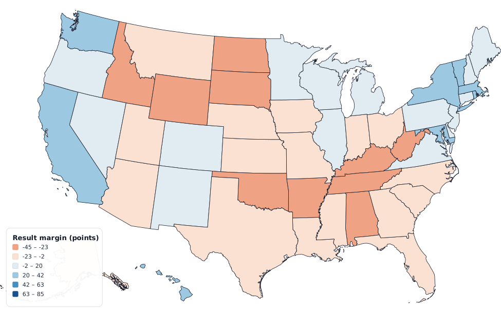
What this map does not do
Worth saying plainly, because the alternative is you finding out three steps in:
- No counties and no congressional districts. The unit is the state.
- No electoral-vote weighting and no cartogram. Wyoming gets its geographic area, not three squares. If your point is that land does not vote, this is not the map that makes it.
- No results data included. You bring the numbers; the editor colours them.
- No state flags. Flags are switched off on this map on purpose: the flag
lookup is by country code, so
CAwould resolve to Canada’s flag andNEto Niger’s: the wrong flag, silently, which is worse than none.
Labels, title, export
Turn on State names and search for the states you actually want named; naming all 51 is rarely the right call. When a name will not fit inside a state (the Northeast, every time), the label moves into a callout box beside it with a short leader line, rather than writing across three neighbours.
Title on the map puts a heading into the image itself, which is what you want when the map is going into a deck where the slide title is busy.
Export gives you PNG, JPEG, WebP or SVG, at 2000, 4000 or 8000 px on the long edge. 4000 is right for a slide or a page; 8000 is for print. SVG if the figure will be resized or edited later. If you are zoomed in, the export menu asks whether you want the current view or the whole map. Nothing is watermarked.
Share link compresses the entire map into a URL fragment, so a link
reproduces your map for whoever opens it with nothing stored on a server. Save
file writes a .json you can reopen later, worth doing on election night,
when you will want to make the same map again with different numbers.
Each map keeps its own autosave, so opening the world map does not overwrite the US map you were working on. That storage is per-browser and per-machine, though; for anything you care about, export the file.
Next steps
- The full tour of the editor: written against the world map, but the painting, legend and export sections apply here unchanged.
- Choropleth maps from spreadsheet data: scales, classes and the decimal-separator trap.
- A map of Brazil’s states: the same workflow on the 27 federative units.
Ready to make yours? Oh My Maps! is free, runs in the browser and needs no sign-up. Your map is saved locally as you work, and exports carry no watermark.
Open the editor