How to Make a Custom World Map Online (Free, No Sign-Up)
·9 min·View as Markdown
TagsWorld MapMap ProjectionsChoropleth MapsMap Export
Written byJordan Hale — Writer, Oh My Maps!
Contents
- 1. Start painting: the whole product in one click
- 2. Colours you will actually reuse
- 3. Continents, unions and other bulk selections
- 4. Patterns, when colour is not enough
- 5. Ocean, background, Antarctica
- 6. Labels and flags
- 7. The legend
- 8. Pick a projection
- 9. Export
- 10. Where maps live between sessions
- Next steps
Most reasons to want a custom world map are small and specific. You need a slide showing where your team operates. A figure for a paper. A map of the countries you have been to. A quiz handout with five countries shaded. None of those are worth installing GIS software for, and none of them should require an account.
This is the full walkthrough for doing it in a browser tab with Oh My Maps!, a free world map editor that runs entirely client-side. Nothing is uploaded, nothing is watermarked, and there is no sign-up step to get past. Read it top to bottom the first time; after that you will mostly be jumping to the section you need.
1. Start painting: the whole product in one click
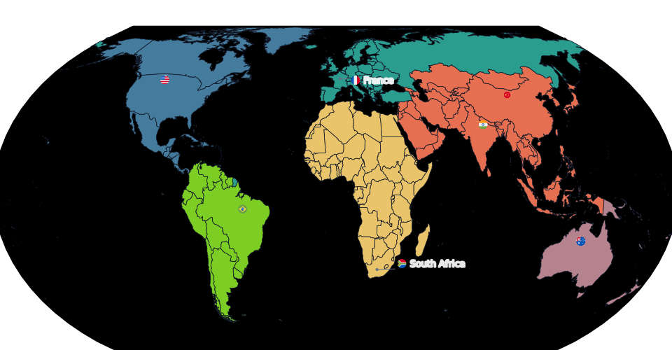
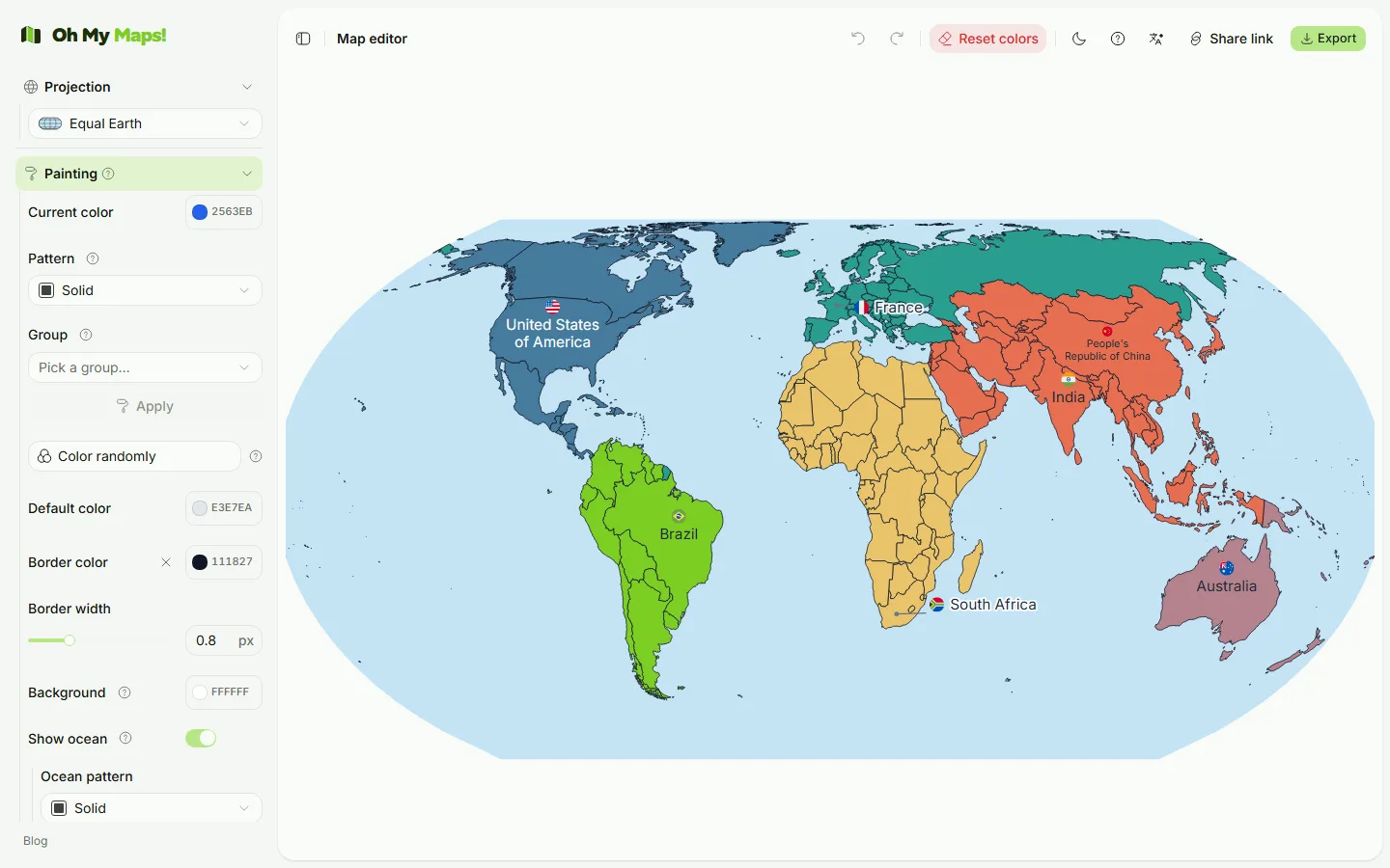
Open the editor and you get a world map of 235 countries and a sidebar of controls. Pick a colour under Paint, then click a country. That is the entire core loop.
Three things about clicking that are worth knowing on day one:
- Clicking a country that already has the current colour removes it. Painting is a toggle, so you undo a mistake by clicking the same country again.
- Shift+click or Ctrl+click applies the colour instead of toggling. This is what you want when you are sweeping across a region: without the modifier, the first country you re-touch would clear itself.
- Right-click opens a context menu for that country: pick a colour from your saved palette, apply a pattern, or colour it randomly, without moving to the sidebar first.
Zoom with the mouse wheel (or pinch on a touchscreen), drag to pan, and use Reset view in the Zoom section to get back. Painting still works at any zoom level.
Everything you do is undoable. Ctrl+Z and Ctrl+Shift+Z (or Ctrl+Y) walk a
100-step history, and each painted country is its own step. Bulk actions are
deliberately one step: undoing “colour the European Union” gives you back all
27 countries at once, not one per press.
2. Colours you will actually reuse
The colour picker has a saturation/brightness area, a hue slider, a hex field and
an eyedropper. Below it is My colours, a palette that persists across
sessions: press + to save the colour you are on, click a swatch to return to
it, and right-click (or the small ×) to remove one.
That palette is shared by every colour control in the app: the paint brush, the border, the ocean, label text, legend swatches, choropleth overrides. Save your brand green once and it is available everywhere, including in the right-click menu on a country.
Two more colour controls sit near it:
- Default fill is the colour of every country you have not painted. Change it and the whole unpainted world changes with it.
- Border colour and border width control the country outlines. Width runs from 0 to 3; the default 0.5 is a hairline. Borders are measured in screen pixels, so zooming in shows more geography at the same line weight rather than inflating every frontier into a band.
3. Continents, unions and other bulk selections
Painting Africa one country at a time is a bad use of an afternoon. The Groups control applies the current colour to an entire set in one action:
- the seven continents (Antarctica included);
- the European Union, NATO, BRICS, OPEC, ASEAN and Mercosur.
The organisation lists are maintained by hand and dated, with the awkward cases resolved explicitly: Angola has been out of OPEC since 2024, Saudi Arabia never formalised BRICS membership, Timor-Leste joined ASEAN in 2025, Venezuela is suspended from Mercosur. If you need a different definition, apply the group and then click the two or three countries you disagree about.
There is also Colour randomly, which is more useful than it sounds for reference maps where every country simply needs to be distinguishable from its neighbours. Hues are walked by the golden angle rather than drawn independently, so adjacent countries do not come out as “the same colour, badly printed”.
Follow along. Everything above is two clicks from a blank map: the editor opens straight into it.
Open the editor4. Patterns, when colour is not enough
Some maps need more than hue: printed in greyscale, two mid-tones collapse into each other, and colour-blind readers lose distinctions that looked obvious on screen. The editor has two fill patterns, diagonal hatching and dots, that belong to the brush, alongside the colour. Choose a pattern and the next country you click gets colour and texture together.
The tile is a pale tint of your colour with the strokes at full strength, so a hatched country still reads as “the blue one” at a glance while being obviously different from a solid neighbour. The pattern is anchored to the geography, so it survives zoom and pan and scales correctly into an 8000-pixel export, no moiré, no on-screen-versus-file surprises.
The ocean has its own pattern field, which is the cheapest way to make land pop without changing a single country colour.
5. Ocean, background, Antarctica
Three switches change the character of a map more than any of the above:
- Ocean is off by default. Turning it on draws the projected sphere behind the countries; land and border colours shift together when you do, because one without the other tends to leave something illegible.
- Background colour paints the frame behind everything. It is
nullby default, meaning the page shows through and follows your light/dark theme. - Antarctica can be removed entirely. It is also dropped from the fit calculation, so the rest of the world grows to fill the space it vacated. (Mercator excludes it regardless: see the projections article.)
6. Labels and flags
Turn on Country names and search for the countries you want labelled. Naming all 235 is almost never the right call; naming the six you are talking about is.
Font size is a slider. Label colour defaults to automatic, which is not one colour but a per-label decision: black or white, whichever contrasts with the country underneath. Set an explicit colour and it applies to inside labels, external callouts and the numbered key alike.
When a name does not fit inside its country, the label moves into a callout placed next to the territory: the editor searches rings around the country for free space, preferring water, and draws a short leader line from the box to the country’s centre. It is not a gutter of names stacked at the edge of the frame; Colombia’s label lands in the Pacific right beside Colombia. If a map gets so crowded that some label has nowhere to go, the whole set switches to numbered mode with a key panel, which is the honest answer at that density.
Flags are optional and sit beside the name, circular or rectangular. They are drawn into the map’s SVG, so they appear in exported files too, not just on screen.
Finally, Title and Subtitle put a heading on the map itself. Useful when the map is going into a deck where the slide title is doing other work.
7. The legend
Turn on the legend and you get an editable list: a title, and rows of colour + label that you add and remove yourself. Position it in any of the four corners, and set its font size: every dimension of the legend (padding, row height, swatch size) is derived from that one number, so it stays proportional.
In data mode the legend is generated from the scale instead, including a gradient bar for continuous scales. Screen and export render the same legend object, so the file can never disagree with what you approved on screen.
8. Pick a projection
There are five: Natural Earth, Robinson, Miller, Mercator, and a rotatable orthographic globe. The default, Natural Earth, is the right answer for most maps: it keeps relative area close to reality, so a country’s ink is close to its size.
The short version of the long article: use Natural Earth unless you have a reason not to; use the globe when you want a hemisphere to be the point; avoid Mercator for anything where area matters. There is a full comparison in Which map projection should you use?.
9. Export
Export gives you PNG, JPEG, WebP or SVG. All four come from a single serialised SVG of the map, so the raster can never drift from the vector.
- Resolution: 2000, 4000 or 8000 pixels on the long edge. 4000 is plenty for a slide or a page; 8000 is for print or for a poster you will crop.
- SVG is vector: infinitely scalable, and editable afterwards in Illustrator, Inkscape or Figma.
- If you are zoomed in, you get a choice between exporting the current view or the whole map.
- Labels are embedded with the font, so text in the exported file looks like text on screen. Exports are unwatermarked, and the resulting image is yours.
You can also export your data back out as CSV or TSV, and save the whole map as a
.json file to reopen later. There is a Share button too: it compresses the
entire map into a URL fragment, so a link reproduces your map for whoever opens
it without anything being stored on a server.
10. Where maps live between sessions
The map autosaves to your browser’s local storage, restored before the first
frame is drawn. You do not lose work by closing the tab. That also means the map
is tied to that browser on that machine. For anything you care about, export a
.json or copy a share link.
Next steps
Three common jobs, each with its own guide:
- Make a map of countries you have visited: the travel-map workflow, including how to handle “lived in” versus “passed through”.
- Create a choropleth map from spreadsheet data: paste a CSV, pick a scale, get a legend.
- Which map projection should you use?: Natural Earth vs Mercator vs Robinson, and two more.
And if the world is the wrong frame, three of the maps have their own address, their own regions and their own article:
- A map of Europe: 51 countries and territories, framed on the continent, microstates included.
- A US election map: the 50 states and DC, Census regions, results pasted from a spreadsheet.
- A map of Brazil’s states: the 27 federative units and the five IBGE regions.
Ready to make yours? Oh My Maps! is free, runs in the browser and needs no sign-up. Your map is saved locally as you work, and exports carry no watermark.
Open the editor