How to Make a Map of Europe
·7 min·View as Markdown
TagsRegional MapsMap ProjectionsSpreadsheet Import
Written byJordan Hale — Writer, Oh My Maps!
Contents
A world map is the wrong frame for a European subject. Zoom into Europe on one and half your pixels are Atlantic; the countries that carry the story, Slovenia, Estonia, Luxembourg, end up two millimetres wide, and the microstates are gone before you start.
ohmymaps.com/europe/ is the same browser editor framed on Europe instead: 51 countries and territories at a size you can click, no account, no upload, and no watermark on what you export.
What is on the map
51 separate shapes. That count is higher than most lists of “European countries” because it includes the territories that a map has to draw whether or not a list mentions them: the Åland Islands, the Faroe Islands, Guernsey, Jersey and the Isle of Man, plus the microstates: Andorra, Liechtenstein, Malta, Monaco, San Marino and the Vatican. They are all individually clickable. Several of them are a few pixels at the default zoom, so scroll in before you aim; painting works at any zoom level.
Iceland is in. Cyprus is in. Belarus, Moldova and Ukraine are in.
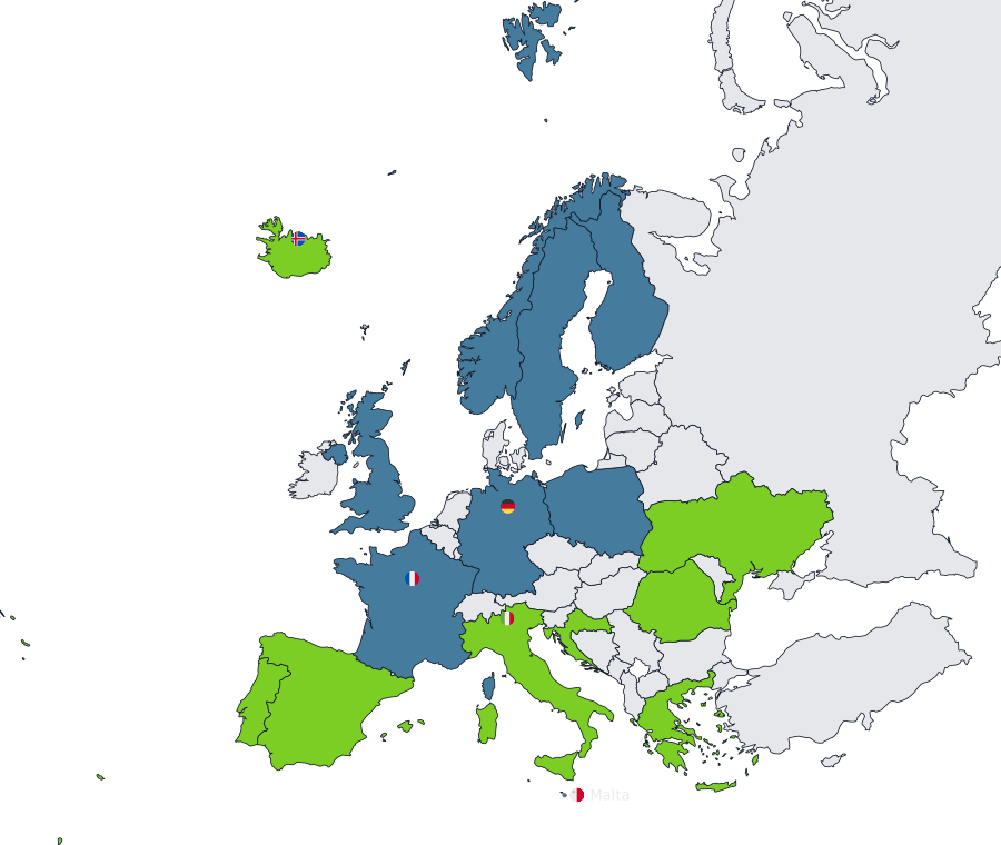
Russia and Turkey are cut by the frame, on purpose
Both are on the map, and both extend well past the edge of it. The frame is a fixed geographic box (roughly 25°W to 45°E and 34°N to 72°N), so European Russia and European Turkey are drawn and everything east of the box simply falls outside the picture.
This is what most people mean by a map of Europe, and the alternative is worse: dropping the two countries leaves a white hole along the eastern edge and a map that stops before the continent does. One consequence to know about, though: clicking Russia colours the whole country, not the visible part. You are painting a country, and the frame is only deciding how much of it you can see.
Three projections, calibrated for Europe — not the world map’s five
Unlike the world map, this one does not offer Natural Earth, Robinson or Miller: those are compromises for showing the whole planet at once, and on a single continent they buy you nothing that a projection built specifically for Europe does not do better. Instead there are three, and Conic conformal is the default.
- Conic conformal preserves shape locally and keeps distortion low and even across the frame — the standard choice for a Europe-shaped map, and the one official agencies reach for first.
- Azimuthal equal-area preserves area instead of shape, calibrated to the same projection (ETRS89-LAEA) Eurostat uses for its own statistical maps. Reach for this one over Conic conformal specifically when you are shading countries by a per-country number: a choropleth’s whole argument is that area does not lie about relative size, and an equal-area projection is what keeps that true.
- Mercator is still here, and it is still the wrong one for a choropleth: this frame spans roughly 34°N to 72°N, and Mercator’s inflation grows with latitude across exactly that range. Switch to it and Iceland, Norway, Sweden and Finland swell against Spain, Italy and Greece, which get squeezed into the bottom of the picture — handing the north an area advantage your data did not give it.
There is no rotatable globe on this map: an orthographic view of a single continent has nothing to show that the flat frame does not already show better, so that option stays on the world map.
Start clicking. The Europe map opens blank, saves in your browser as you go, and never asks who you are.
Open the Europe mapPainting
Pick a colour under Painting and click countries.
- Clicking a country that already has the current colour clears it: painting is a toggle.
- Shift+click or Ctrl+click applies instead of toggling, which is what you want when sweeping across a run of neighbours. On a map this dense you will use it constantly.
- Right-click a country for its own menu: choose a colour, apply a pattern, or toggle Show name to label that one country.
- Patterns, diagonal hatching and dots, belong to the brush alongside the colour, and they are the fix for a map that has to survive greyscale printing or a colour-blind reader. On a crowded map they also separate two similar blues that would otherwise merge along a shared border.
Ctrl+Z walks back a step at a time.
Group presets: the EU, the eurozone, Schengen, the Nordics, the Balkans
The Group control applies one of five ready-made blocs in a single click, each its own undo step:
- European Union — the 27 member states.
- Eurozone — the 20 countries using the euro, Croatia (2023) included, Bulgaria and Romania excluded (in the EU, not the currency).
- Schengen Area — the 29 full members: the EU minus Ireland and Cyprus, plus Iceland, Liechtenstein, Norway and Switzerland.
- Nordics — the five Nordic countries plus the Faroe Islands and Åland; Greenland sits on the world map instead, inside North America.
- Balkans — the Western Balkans (Albania, Bosnia and Herzegovina, North Macedonia, Montenegro, Serbia): five rather than six, because this dataset has no separate id for Kosovo.
Apply a group, then click the two or three countries you disagree with; that is still one undo step for the group plus one per correction, not one per country.
For anything that is not an off-the-shelf bloc (your sales regions, the countries you have visited, a language family), you were going to click them individually either way, and this is the map where they are big enough to hit.
Flags work here
This is the only non-world map in the editor with flags, and the reason is
mechanical: the Europe map uses the same ISO country codes as the world map, so
the flag lookup resolves correctly. On the US and Brazil maps flags are switched
off, because CA and PR would fetch Canada’s and Puerto Rico’s flags rather
than California’s and Paraná’s.
Turn on Country names, search for the countries you want labelled, and switch on Flags to put a circular or rectangular flag beside each name. They are drawn into the map’s SVG, so they survive into the exported file rather than being a screen-only decoration.
Labelling all 51 is not a plan. When a name will not fit inside its country, and in Europe that is most of them, the label moves into a callout box beside the country with a short leader line, placed in nearby free space, preferring water. If a map gets so crowded that some label has nowhere left to go, the whole set switches to numbered mode with a key panel, which at that density is the honest answer.
Data from a spreadsheet
Switch to Data mode and paste two columns, country and value, out of Excel, Google Sheets or Numbers.
Because the ids here are real country codes, the matcher accepts everything the
world map does: English, Portuguese or Spanish names, ISO alpha-2 (FR), alpha-3
(FRA) and numeric codes (250 for France, and 008 or 8 for Albania:
spreadsheets love to eat a leading zero by treating the column as a number), plus
a hand-maintained list of the alternate spellings that generated country-name
lists get wrong.
Rows for countries outside the frame (Japan, Brazil, the United States) will not match, and they appear in the import preview’s “not recognised” list rather than vanishing. That list is the part worth reading before you accept an import.
Scale choice, class counts, the no-data colour and the per-column decimal separator detection are covered in How to create a choropleth map from spreadsheet data. Everything there applies unchanged here; only the frame is different.
Export and share
PNG, JPEG, WebP or SVG, at 2000, 4000 or 8000 px on the long edge. 4000 covers a slide or a page, 8000 is for print, SVG is the right default for a figure that will be resized or edited later. No watermark on any of them.
Share link compresses the whole map into a URL fragment, so a link reproduces
your map for whoever opens it with nothing stored on a server. Save file
writes a .json you can reopen later.
Each map has its own autosave, so working on Europe does not disturb the world map you left half-painted. That storage is per-browser and per-machine: if the map matters, keep the file.
Next steps
- The full tour of the editor: every control, on the world map.
- A map of countries you have visited: if your travel is mostly European, this is the frame to build it in.
- Which map projection should you use?: all five, and what each one gives up.
Ready to make yours? Oh My Maps! is free, runs in the browser and needs no sign-up. Your map is saved locally as you work, and exports carry no watermark.
Open the editor