How to Make a Colour-Blind-Friendly, Print-Safe Map with Patterns
·3 min·View as Markdown
Written byJordan Hale — Writer, Oh My Maps!
Contents
Colour alone is a fragile way to carry a map. Print it in greyscale and two mid-tones collapse into each other. Show it to a colour-blind reader and red/green or blue/purple pairs that look obvious on your screen can be indistinguishable. Neither problem is rare: printing in black and white and colour vision deficiency both affect a meaningful share of any real audience.
Oh My Maps! has two fill patterns built for this, and they work alongside colour rather than instead of it.
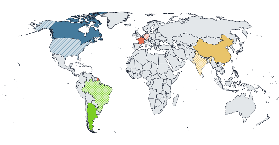
The two patterns
Diagonal hatching and dots. Both belong to the brush, next to the colour picker: choose a pattern, then click a country, and it gets colour and texture together in one action. A country can also be textured after the fact from its right-click menu, without touching the sidebar.
The tile itself is a pale tint of your chosen colour, with the hatching or dots drawn at full strength on top. That is a deliberate choice, not the obvious one: a fully transparent tile would let the ocean colour show through between the strokes, so a hatched country would read as unpainted water in places. The pale-tint tile keeps the country reading as “the blue one” at a glance while still being unmistakably different from a solid neighbour of the same colour.
See it on your own map. Paint a country, then apply a pattern from the brush and watch the texture follow the colour.
Open the editorWhere it helps most
- Two adjacent countries in similar hues. A shared border between two close blues is hard to see; give one of them hatching and the border reads instantly, even before anyone notices the colours are different.
- A map that will be photocopied or printed on a mono printer. Test it by looking at your map with saturation turned all the way down. If two regions still separate, the pattern is doing its job.
- A “third tier” on a travel or status map, where you have run out of colours that stay distinct from each other but still want one more legible category. Pattern plus colour buys you that category without adding a fourth hue nobody can tell apart from the third.
The ocean has its own pattern
Separately from country fills, the ocean can carry its own pattern too, drawn as a second, translucent layer over the water colour. It is the cheapest way to make land stand out from sea without touching a single country’s fill, and it is worth trying before reaching for a darker ocean colour.
What patterns do not do
Patterns only apply in manual painting mode. Switch the map to Data mode for a choropleth and the pattern control disappears from the sidebar: in data mode, colour comes entirely from the scale you chose, and every country’s fill is solid. This is not a bug to work around; a choropleth’s entire point is that colour intensity maps to value, and a hatched country would break that mapping without adding real information. If you switch back to manual mode later, any pattern you had set is still there, waiting.
Colouring randomly always produces solid fills. The random-colour tool (covered in how to make every country a different colour) skips patterns on purpose, because its whole point is a quick, uniform-looking reference map.
Export carries the pattern with it
Patterns are drawn as SVG <pattern> definitions inside the map itself, not
as an effect layered on afterward, so they survive into every exported
format exactly as painted: PNG, JPEG, WebP and SVG all carry the texture, at
any resolution up to 8000 px. There is no separate “flatten for print” step
and nothing to double-check after export.
Next steps
- The full tour of the editor covers painting, colours and export end to end.
- A map of countries you have visited uses patterns to keep a “transited” tier legible next to “lived in” and “visited”.
Ready to make yours? Oh My Maps! is free, runs in the browser and needs no sign-up. Your map is saved locally as you work, and exports carry no watermark.
Open the editor