How to Make Every Country a Different Colour (Random Colour Tool)
·3 min·View as Markdown
TagsWorld Map
Written byJordan Hale — Writer, Oh My Maps!
Contents
Sometimes a map just needs every country to look different from its neighbours, with no data, no legend and no argument attached: a decorative background for a slide, a generic “world” image, a base map you will label over. Oh My Maps! has a one-click tool for exactly this.
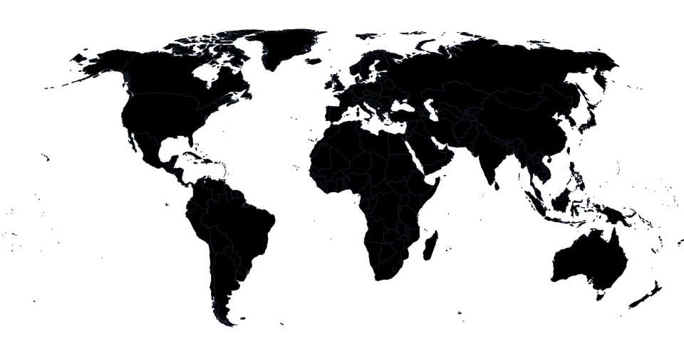
The one-click version
Open Groups and choose Colour randomly. Every country on the map is
painted at once, and the whole action is a single undo step: Ctrl+Z
clears all 235 colours in one press if you want to start over.
Try a few rolls. Colour randomly, undo, colour randomly again, until one composition looks right.
Open the editorWhy it does not look like a mess
Independently random hues tend to produce exactly the failure you would expect: two neighbouring countries land on nearly the same colour by chance, and the border between them disappears. This tool avoids that by walking the colour wheel by the golden angle from a random starting point rather than picking each country’s hue independently. The practical result is that adjacent countries reliably end up visually distinct, without the washed-out look of low-saturation colours or the harshness of picking pure primary hues at random. Saturation and lightness are fixed for every country, so no country ends up looking pale next to a neon neighbour.
What it deliberately does not do
No patterns. Colouring randomly always produces solid fills, on purpose: the tool is built for a fast, uniform-looking reference map, and mixing in hatching or dots at random would work against that. If you want texture on top afterward, apply it by hand or with the right-click menu on individual countries once the base colours are set.
No data behind it. This is not a choropleth tool; there is nothing to paste and nothing to scale. If what you actually want is countries shaded by a real number, that is a different workflow, covered in how to create a choropleth map from spreadsheet data.
Where it is actually useful
- A “colourful world” background image for a slide, a website header or a title card, where the point is visual variety rather than meaning.
- A quick way to make every country individually distinguishable before you manually re-colour just the handful you actually care about, which is often faster than starting from a blank map and picking colours one at a time for regions you were going to leave generic anyway.
- Testing how a map reads with many colours at once, before you commit to a specific palette for a real project.
Combine it with a reset
Ctrl+Z and Ctrl+Shift+Z walk the full 100-step undo history the same as
any other edit, so rolling the colours a few times to see which composition
you like is cheap. Reset colours, in the header, clears every colour and
pattern in one action if you decide to start over from scratch instead.
Next steps
- The full tour of the editor covers painting, groups and export end to end.
- How to make a geography quiz or classroom map for a use case where random colour makes a fast, no-data base map.
Ready to make yours? Oh My Maps! is free, runs in the browser and needs no sign-up. Your map is saved locally as you work, and exports carry no watermark.
Open the editor