How to Make a Rotating Globe Map (Orthographic Projection)
·4 min·View as Markdown
Written byJordan Hale — Writer, Oh My Maps!
Contents
Most map projections lay the world flat, which is convenient and also exactly why they never look like the planet actually does. Oh My Maps! includes one projection that does not flatten anything: an orthographic globe you can spin by dragging, showing the world the way a photograph of a globe would.
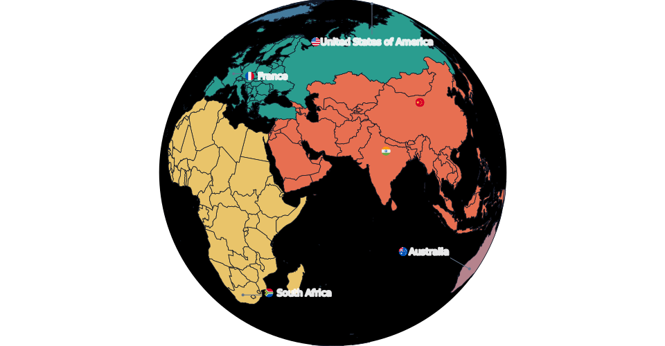
Turning any map into a globe
Paint your map normally, in whichever projection is easiest to work in, then open the Projection control and switch to Orthographic. Your colours, patterns, labels, legend and data all carry over unchanged; only the frame changes. Switching back to a flat projection is just as instant, so there is no risk in trying it on a map you already spent time on.
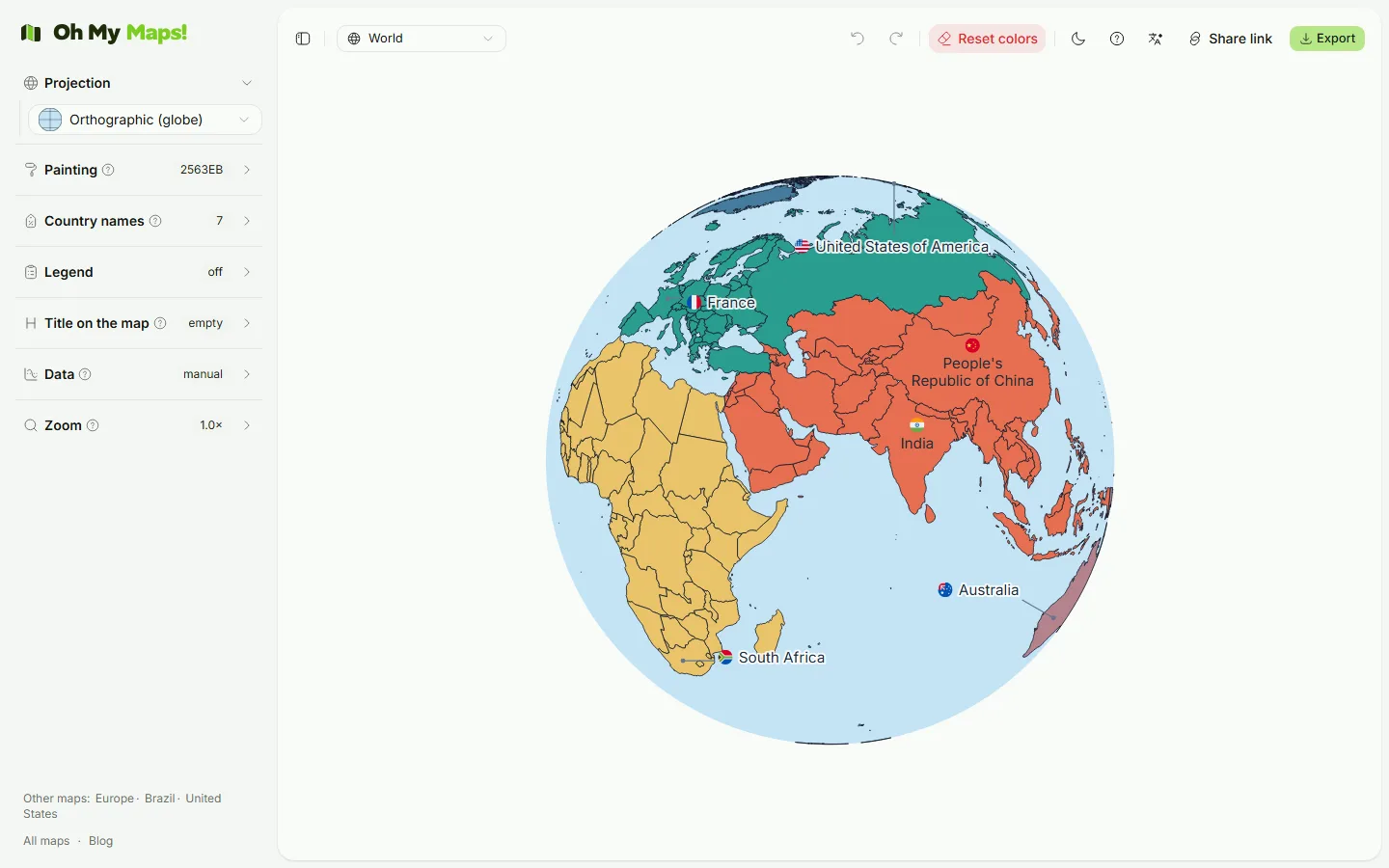
Rotating it
Click and drag anywhere on the globe to rotate it, in any direction. There is no separate “rotate mode” to turn on first: dragging the globe is always a rotation. While you are actively dragging, the editor briefly lowers the rendering precision to keep the motion smooth, then restores full detail the instant you let go, so the globe stays responsive even while every country’s shape is being recomputed continuously.
One limitation worth knowing up front: dragging always rotates, even when you are zoomed in. There is no separate pan gesture on the globe the way there is on the flat projections, so if you want a specific region centred while zoomed in, get the rotation right first and then zoom.
Spin it yourself. Switch to Orthographic and drag the globe to put any region front and centre.
Open the editorWhen to reach for the globe instead of a flat map
The globe is the right choice when one hemisphere genuinely is the story, not when you need every country visible and comparable:
- A regional map that should not pretend to be global. A map of Asia, the Americas or Africa specifically, framed as a globe, reads as “here is this part of the world” rather than “here is the whole world with most of it greyed out”.
- A title slide or cover image. The curve of the limb and the visible edge of the sphere read as more considered than a flat rectangle, which is exactly what a title slide wants and a data map usually does not.
- A travel map clustered on one side of the planet. If your painted countries are mostly in Europe and Asia, rotating the globe to centre that hemisphere makes better use of the frame than a flat world map with the Pacific taking up a third of the image for no reason.
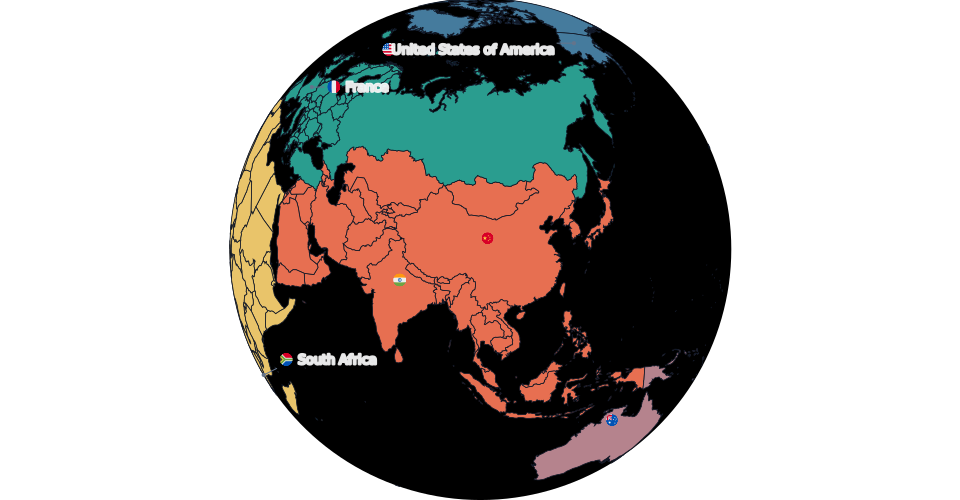
When not to
Half the world is always hidden on a globe, by definition, and the countries near the visible edge are compressed into slivers that are hard to read even when they are not hidden outright. For any map meant to compare countries against each other globally, a choropleth especially, a flat projection is the honest choice; the four others available (Natural Earth, Robinson, Miller and Mercator) are covered in full in which map projection should you use?.
Exporting the globe
Export works the same as on any other projection: PNG, JPEG, WebP or SVG, at 2000, 4000 or 8000 px on the long edge, with the current rotation baked into the file exactly as shown on screen. If you are zoomed in when you export, you get the choice between the current view and the whole frame, the same choice offered on flat projections.
Next steps
- Which map projection should you use? covers the other four projections and when each one is the right call.
- How to make a map of countries you’ve visited is a common case where a rotated globe, centred on your travel, beats a flat world map.
Ready to make yours? Oh My Maps! is free, runs in the browser and needs no sign-up. Your map is saved locally as you work, and exports carry no watermark.
Open the editor