How to Make a US Sales Territory or Regional Map (Census Regions Included)
·3 min·View as Markdown
TagsRegional MapsChoropleth Maps
Written byJordan Hale — Writer, Oh My Maps!
Contents
A sales territory map and a US election map are drawn on the exact same 51 shapes, but they answer different questions: one is “who won”, the other is “where are our customers and who covers them”. Oh My Maps! supports both from the same US editor.
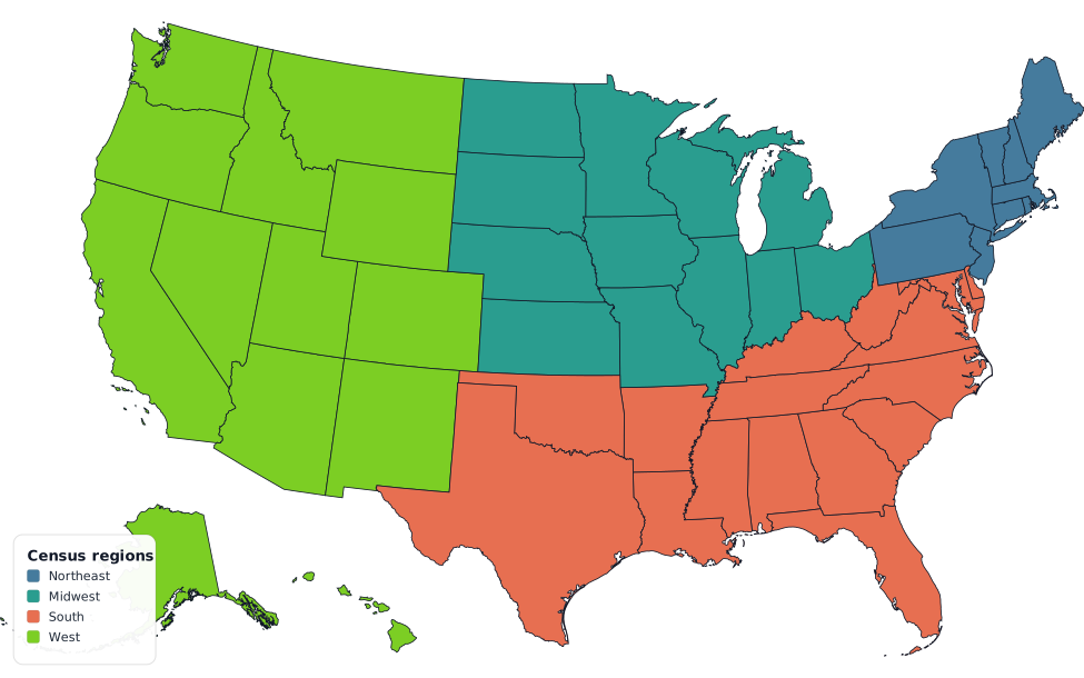
Start from Census regions, then adjust
The Group control offers the four official US Census Bureau regions: Northeast, Midwest, South and West. Applying one paints every state in it at once, as a single undo step, which makes it a fast starting point even though real sales territories rarely match a federal statistical boundary exactly.
The practical workflow: pick a colour for a territory, apply the Census region closest to it, then Shift+click or Ctrl+click the states you need to move in or out. A rep who covers Missouri and the Dakotas but not the rest of the Midwest is three clicks away from the group, not 51 clicks from a blank map. Full detail on the region definitions (which states go where, and the cases people get wrong, like Delaware being in the South) is in how to colour country groups and alliances.
Start from a region. Apply a Census region, then adjust the two or three states your actual territory splits differently.
Open the US mapColour by a real number instead of a territory colour
If the map is meant to show where the business actually is, not just who covers what, switch to Data mode and paste two columns from a spreadsheet: state and a value, customer count, revenue, number of open deals, whatever the metric is. The state column accepts the full name, the USPS abbreviation, the ISO subdivision code or the FIPS code, so a CRM export in whatever format it comes in usually pastes in without reformatting first.
Choose a sequential scale for a plain quantity like customer count or revenue, where there is no natural midpoint. Choose diverging only if there is a genuine centre worth showing, growth against last quarter’s number, say, with zero in the middle. Full detail on scales, class counts and the decimal-separator handling that avoids a silent factor-of-a-thousand error is in how to create a choropleth map from spreadsheet data.
Two maps, one file
A territory map (hand-painted, one colour per rep or region) and a data map (coloured by a metric) are separate modes on the same document, so you can build the territory version first, export it, then switch to data mode and build the “where the revenue is” version without starting over. Each is its own export; nothing forces you to pick one and discard the other.
What this map does not include
Same limits as the rest of the US editor: no counties, no ZIP codes, and no
state flags (the flag lookup is by country code, so it is switched off here
to avoid CA silently fetching Canada’s flag instead of California’s). If
your territories are drawn below the state level, this map is the wrong
resolution for the job; it colours states, not districts within them.
Export for the deck it is going into
PNG at 4000 px covers most sales decks and one-pagers; 8000 px if the map is going on a printed handout at a larger size. SVG is worth keeping if a designer will be adjusting the file later. Title on the map bakes a heading like “Q3 Territory Coverage” directly into the image, which is handy when the map has to stand on its own in a shared document rather than sit under a slide title.
Next steps
- How to make a US election map covers the same 51 shapes and Census regions from the results-map angle.
- How to create a choropleth map from spreadsheet data goes deeper on scales, classes and importing real numbers.
- How to colour country groups and alliances covers the Group control across all four maps.
Ready to make yours? Oh My Maps! is free, runs in the browser and needs no sign-up. Your map is saved locally as you work, and exports carry no watermark.
Open the editor