What Is the Equal Earth Projection? The Map the UN Named, Explained
·4 min·View as Markdown
TagsEqual EarthMap ProjectionsWorld Map
Written byJordan Hale — Writer, Oh My Maps!
Contents
Equal Earth is the projection the UN General Assembly named by name in its September 2026 resolution, and it is younger than most people assume. It was published in 2018 by Bojan Šavrič, Tom Patterson and Bernhard Jenny, which makes it newer than the smartphone in your pocket.
It exists to solve a specific problem, and the problem is not mathematical. Maps that get area exactly right had been available for over a century. The trouble was that most people found them unpleasant to look at, so nobody used them.
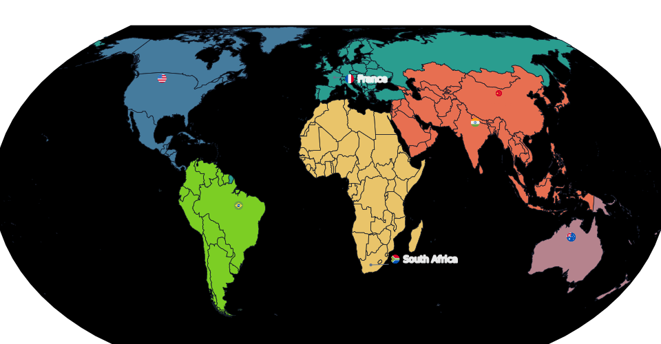
What it preserves
Area, exactly. Equal Earth is an equal-area, or equivalent, projection. Any two regions that cover the same number of square kilometres on the globe cover the same number of square millimetres on the map, wherever they sit on it. Africa comes out fourteen times the size of Greenland because it is fourteen times the size of Greenland.
This is a hard mathematical constraint, not a close approximation. It is the same property the Albers and Lambert azimuthal projections have, and the one Natural Earth and Robinson deliberately do not have.
What it gives up
Shape and angle. This is not optional. A theorem of Gauss guarantees that no flat map can preserve both area and shape, so a projection that locks area down exactly has to spend the error somewhere, and Equal Earth spends it on form. Landmasses near the edges of the map lean and stretch horizontally. Greenland looks squashed. Alaska tilts.
Distance and direction. As with almost every world projection, you cannot measure a distance off it with a ruler, and a straight line on it is not a compass bearing.
If you need a straight line to be a constant heading, you need Mercator, and the UN resolution says so explicitly.
Why it looks the way it does
The technical achievement of Equal Earth is not that it preserves area. Plenty of projections do. It is that it preserves area while looking like a world map people recognise.
Its designers built it to echo the appearance of Robinson, the compromise projection that National Geographic used through the nineties and that shaped what a generation thinks a world map looks like. Equal Earth has the same rounded outline, the same gently curving meridians, and the same pole lines, which means the poles are drawn as short lines rather than pinched into single points. Antarctica and northern Canada therefore read as places rather than as smears along the top and bottom edge.
The comparison that matters here is with the Gall-Peters projection, which is the equal-area map most people have actually seen, usually in a story about how Mercator lies. Gall-Peters is also exactly equal-area, and it is famous for looking dreadful: continents stretched into vertical ribbons. Its reputation did real damage to the case for equal-area maps in general, because it let people treat “honest about size” and “ugly” as a package deal.
Equal Earth is the argument that they were never the same thing.
Where it sits among the alternatives
Equal Earth is not the only equal-area world projection, and the UN resolution does not claim it is. Its operative text calls for equal-area projections generally and names this one as an example, which is why France was able to comply by adopting Eckert IV instead.
Eckert IV is also pseudocylindrical, also equal-area, also has a pole line, and also dates from a century earlier (1906). Mollweide is another. The practical differences between them are matters of proportion and edge curvature, not of correctness. Any of the three answers the resolution.
When to use it
Reach for Equal Earth when the map’s message depends on how big places are:
- a choropleth where a reader will compare the coloured area of one country against another;
- population, land use, emissions, forest cover, anything measured per unit of ground;
- teaching material, which is the case the resolution is explicitly about;
- any map where someone might reasonably ask “wait, is Russia really that big?”
Reach for something else when area is not the point. A travel map of countries you have visited is not making a claim about square kilometres, and Natural Earth will usually look better. That trade-off is worth its own article, which is the next one in this cluster.
Try the projection, not the screenshot. Pick Equal Earth in the sidebar and watch the same map redraw with every area honest.
Open the editorRelated reading: The true size of Africa and Which map projection should you use?.
Ready to make yours? Oh My Maps! is free, runs in the browser and needs no sign-up. Your map is saved locally as you work, and exports carry no watermark.
Open the editor