The True Size of Africa: Why Mercator Shrinks a Continent
·4 min·View as Markdown
TagsMercatorEqual EarthMap Projections
Written byJordan Hale — Writer, Oh My Maps!
Contents
Put a Mercator world map on a wall and ask someone to compare Greenland with Africa. Most people will say they look about the same, because on that map they do.
Africa covers roughly 30.4 million square kilometres. Greenland covers roughly 2.2 million. Africa is about fourteen times larger. Greenland is about 7% of Africa, which is the same fact stated the other way round and is worth remembering because both numbers circulate.
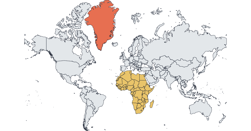
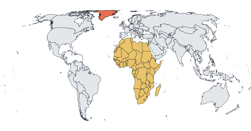
This gap is why the UN General Assembly adopted a resolution about map projections in September 2026, and it is the whole substance of the Correct the Map campaign that the African Union backed a year earlier.
Where the distortion comes from
Mercator is a conformal projection: it preserves angles and local shape. That is not a side effect, it is the entire design goal. Gerardus Mercator published it in 1569 so that a navigator could draw a straight line between two ports and sail a single constant compass bearing along it. No other projection makes that as easy, which is why it is still the basis of marine and air charts and of the tiles in most web map apps.
Preserving angle costs area, and the price is not spread evenly. To keep shapes locally correct as the meridians are forced apart into parallel vertical lines, the map has to stretch vertically by the same factor it stretched horizontally. That factor grows as you move away from the equator, and it grows fast.
The consequences run in one direction:
- Near the equator, almost no inflation. Africa straddles the equator, so Africa is drawn close to its honest relative size. It is not shrunk. Everything else is grown.
- At middle latitudes, noticeable inflation. Europe and the United States gain substantially.
- Near the poles, extreme inflation. Greenland, northern Canada, Russia and Scandinavia balloon.
- At the poles themselves, infinity. This is why Antarctica cannot be drawn on a true Mercator at all, and why web maps crop somewhere around 85 degrees.
So the familiar claim that “Mercator makes Africa look small” is slightly off target, and the more precise version is more damning. Mercator draws Africa about right and inflates the temperate and polar world around it. The continent does not shrink. It is crowded out.
Why this stopped being only a cartography argument
A projection is a technical choice, but the maps built on it are not only technical objects. The map on a classroom wall is, for a lot of people, the only picture of the world they will ever study closely, and it is doing work on their sense of proportion the entire time.
That is the argument Togo made when it tabled the resolution on behalf of the African Group, and the text described the correction in terms of cognitive justice. You can find that framing overstated and still concede the mechanical point underneath it, which is that a great many general-purpose maps use a navigation projection for no reason other than inheritance, and pay for it with a systematic distortion that runs the same way every time.
What the fix is not
Two clarifications, because both got mangled in the coverage.
Nobody is proposing to retire Mercator. The UN text explicitly preserves it for marine and air navigation. A rhumb line is still a rhumb line, and no equal-area projection will give you one.
Equal-area does not mean undistorted. There is no undistorted flat map. An equal-area projection buys exact area by spending the error on shape, so on Equal Earth, Greenland is the right size but the wrong shape. That is a better trade for a thematic map and a worse one for a chart you plan to navigate by. The choice is between errors, never between error and truth.
The honest way to check
The fastest way to stop taking anyone’s word for this, including ours, is to paint the two landmasses on a map and flip the projection under them.
Colour Greenland and every country in Africa, then switch from Mercator to Equal Earth. Nothing about your data changes. The countries you selected stay selected, the colours stay put, and the only thing that moves is the amount of the frame each one occupies. Watching that happen in one click does more than any number in a paragraph.
Run the comparison. Paint Greenland and Africa, then flip between Mercator and Equal Earth and watch the fourteen-to-one appear.
Open the editorRelated reading: What is the Equal Earth projection? and How to make an Equal Earth map online.
Ready to make yours? Oh My Maps! is free, runs in the browser and needs no sign-up. Your map is saved locally as you work, and exports carry no watermark.
Open the editor